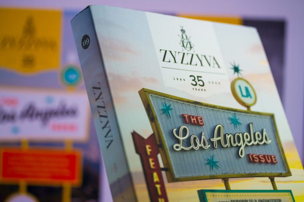
ZYZZYVA: Tell me about your first thoughts when we told you we wanted to do a Los Angeles issue. You know both the place and this journal so well: how did you first envision representing Los Angeles on the covers of ZYZZYVA?
JOSH KORWIN: Every time we begin to create a new issue of ZYZZYVA, I spend a great deal of time thinking about the cover design before committing pen to paper (digitally). So much of the initial work takes place subconsciously while I am doing other things. The L.A. Issue is one of the special issues (including No. 100, No. 111 [The Resistance Issue], and No. 117 [The Bay Area Issue]) that I have had the honor to design entirely on my own. That changes the process and the outcome significantly.
No. 117 was our first special issue themed around a place. It was also our first cover with a variety of type and lettering as the focal point. As a San Francisco journal, we often allude to the iconography of the Bay Area. I had wanted No. 117 to have a sense of the region without being trite; homegrown rather than touristy. I gravitated toward architecture and vernacular lettering, in particular the giant “Port of San Francisco” sign letters facing the Bay from the Ferry Building. And at the time, I was aware of the possibility that we would publish other geographically-themed issues. As a designer, I always try to think ahead of the present moment and develop cohesive systems. But special issues are supposed to be outliers, so I wanted to find the right balance of making these covers still feel like ZYZZYVA—but special—and as unique as the areas they represent.
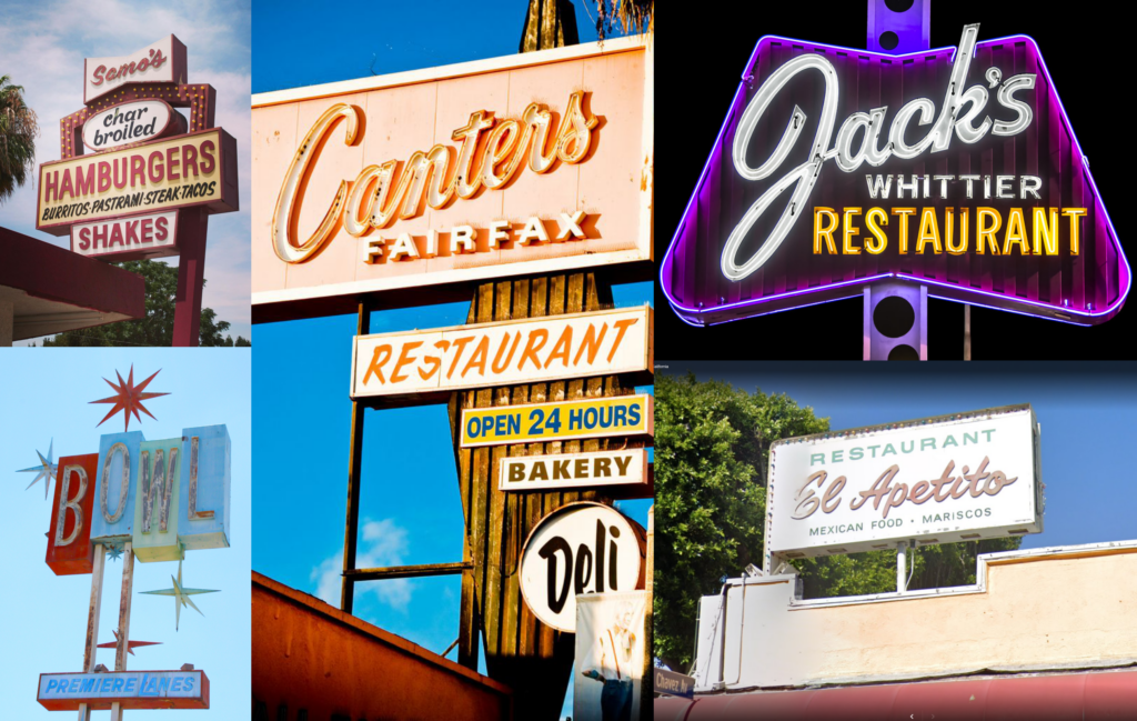
Fast-forward to The L.A. Issue. The Bay Area Issue’s design was successful, and I wanted No. 119 to retain certain abstract components, especially hints of regionally idiomatic lettering. There is no shortage of that in Los Angeles! I grew up on the East Coast, but after college, I moved to California and spent about a decade living in the L.A. area, in Torrance and San Pedro. I eventually got used to the palm trees, but I never stopped gawking at the signage. I used to go around taking photos of mid-century apartment complexes because I could not get enough of the creative, handmade lettering that adorns them. These apartment logos are kind of the understated, residential cousins of the glorious vintage lighted signs of the Googie era found all over Southern California, advertising all-night restaurants, motels, bars, bowling alleys, and theaters. The 1950s and ’60s were periods of phenomenal creativity—every shape and color of roadside sign was explored. In a massive, sprawling metropolis of independent cities, linked by endless avenues, and later by behemoth freeways, an arms race of advertising signage sprung forth. It was—and still is—a great way to get people’s attention when they are speeding by (or, more likely, stuck in standstill traffic). It’s tough to disentangle my own ongoing obsession with these signs from my process in figuring out how to visually represent Los Angeles, but I really do feel like this approach hit the sweet spot between my personal taste and what was best for the subject.
Z: It was a long road from our earliest discussions about a themed L.A. issue to finalizing these designs. Can you talk a little about the false starts—the drafts that didn’t quite work—and how that process brought us to the final concept?
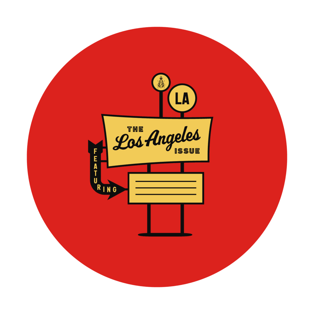
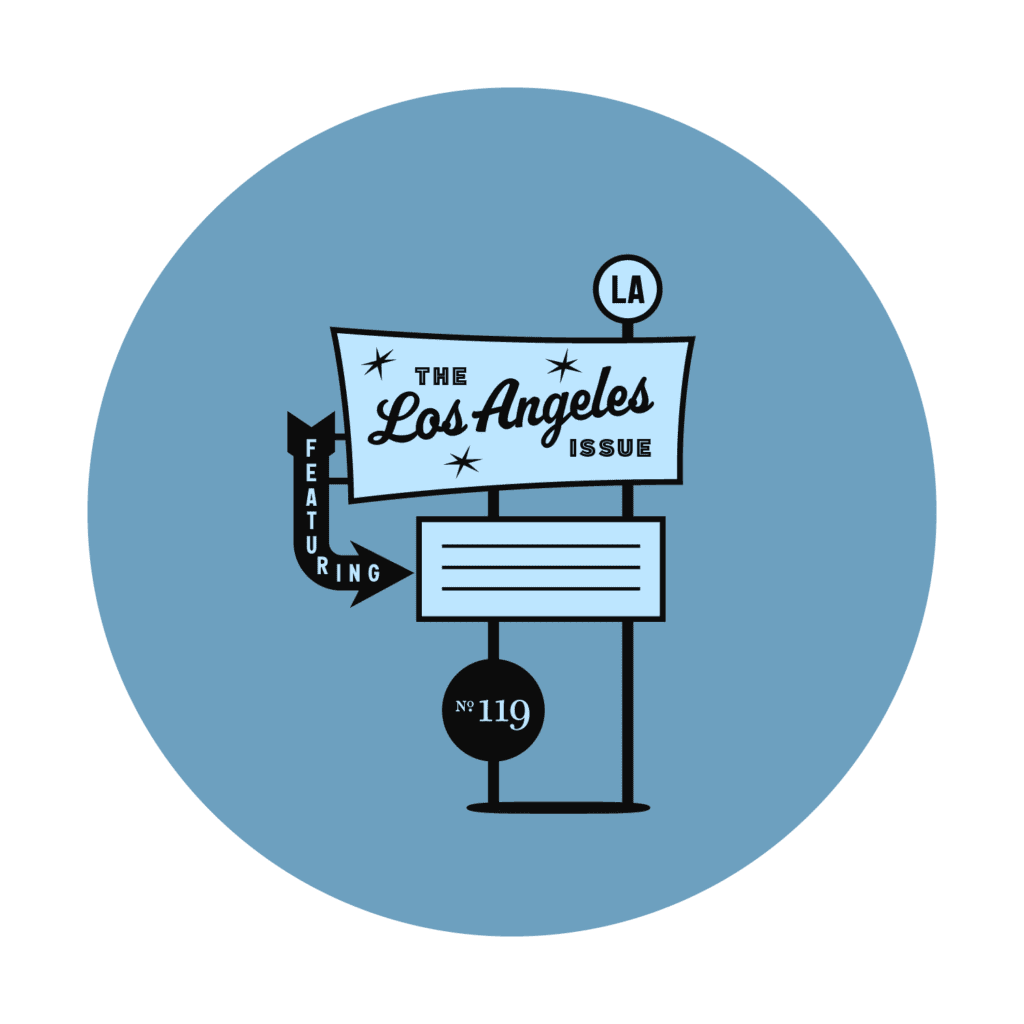
JK: Looking back through my files now, I realize that this was a much more linear process than is typical for me. I knew a roadside sign would play the starring role, shown from the front and back, and that its composition needed to make good use of the space between our banner at the top and the issue number circle at the bottom (which I was able to incorporate into the sign itself). I started with a monochromatic vector drawing in Adobe Illustrator. Oddly enough, my very first sketch of the sign is almost identical in its basic shape to what became the final draft. By time I started drawing, the concept had already been forged in my imagination—I just needed to make it manifest.
I had assembled a folder of inspiration: reference images of real signs from L.A. and other parts of the West, which I sorted through to narrow down the design direction. I wanted to ensure that our sign felt more at home in Southern California than in, say, Las Vegas. On any project, I spend many hours fussing over selecting specific fonts or lettering styles, and this was no exception. I auditioned hundreds of candidates before making a commitment.
With the basic elements in place, my next task was to figure out how to incorporate color, and how the sign would relate to its background. To allow the focus to stay on the sign, the background needed to be relatively quiet, but still clearly evocative of Los Angeles. I collected some photographic options—some shot during the day, some at night—and placed the sign sketch on top, trying out different color palettes and separations. I made twelve different comps and narrowed that down to the six that I shared with the rest of the ZYZZYVA team. At this stage, the problem was that they all looked good. There is nothing worse than having to choose among several equally valid options! Some favorites started to emerge for the team, but I was not feeling clear on a final colorway, and there was still the conundrum of whether to show the sign at night or during the day.


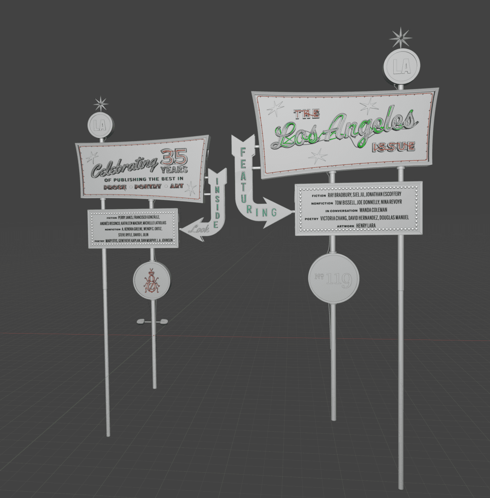
But at that stage, I was still working with flat, vector shapes. I had much more ambitious plans for the cover. My goal was to photo-realistically render the sign using a detailed 3D model. This was in part to challenge myself, but mostly because I believed it to be the best way to execute the concept. I requested that the team hold off on any final verdicts until I finished a draft of the sign as a 3D rendering.
Z: It’s true—we liked all six initial drafts, but the 3D rendering really brings the design alive. It’s a process we know you’ve used before. How does it actually work?
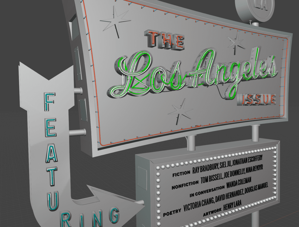
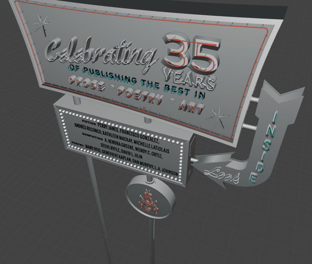
JK: I’ve used 3D modeling and rendering as tool / aesthetic in designing many ZYZZYVA covers, but this was surely its most intense application. The vector shapes from Illustrator were imported into Blender, then extruded to various depths. I used a flat projection of the full cover spread, including the front, back, and spine, to create a camera in the scene with a focal length that allowed the 3D sign to line up precisely with the other 2D cover elements. Little by little, I replaced flat outlines with three-dimensional objects, and applied appropriate materials (painted metal, translucent acrylic, etc.).
With geometry and textures established, I determined which components would be illuminated. Some became channel letters with visible neon, others have arrays of individual incandescent light bulbs or are backlit with internal fluorescents.
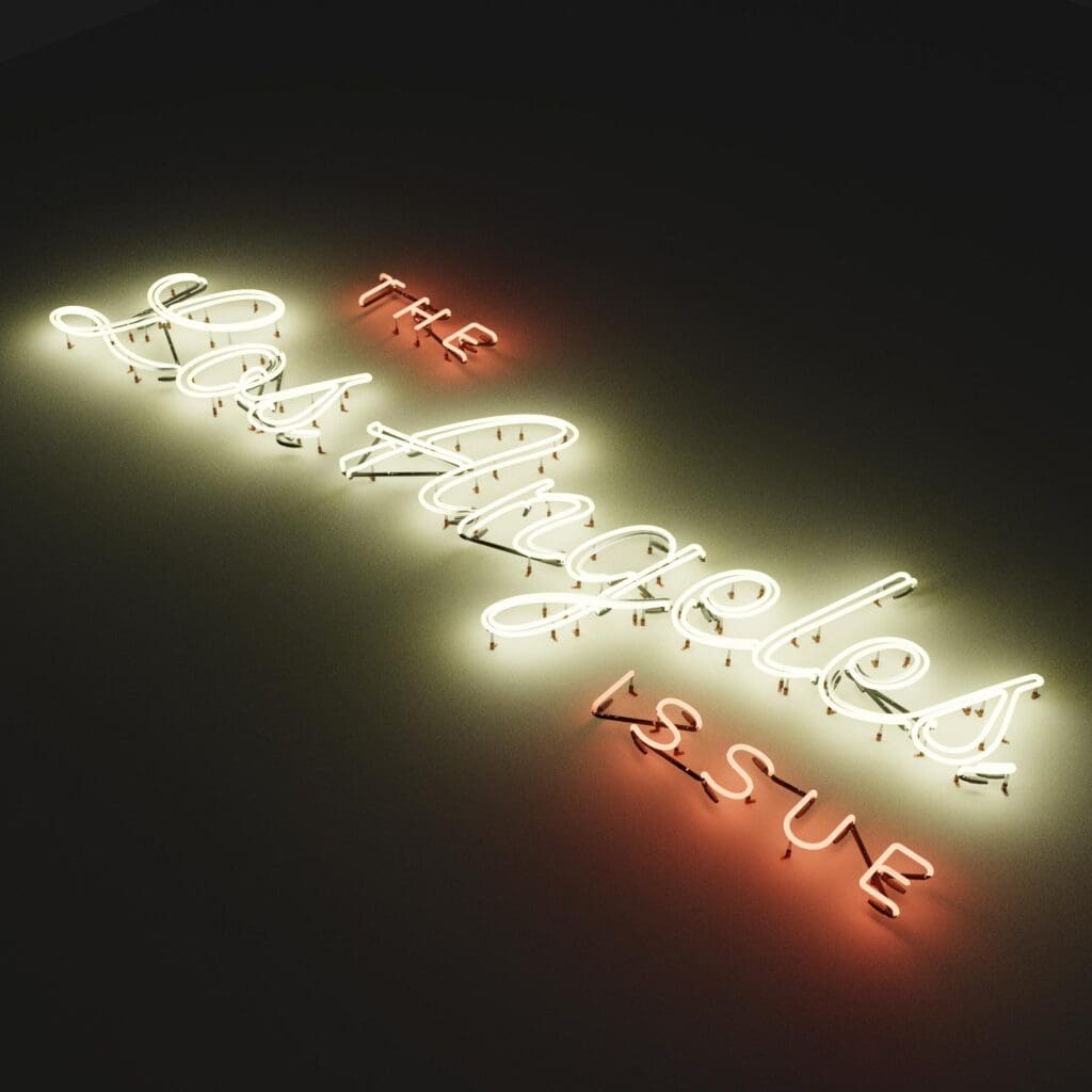
The neon lights were my favorite part, thanks to an incredibly sophisticated tool for Blender called Neon Generator. I started by drawing a two-dimensional representation of the neon tubes as vector paths in Illustrator, carefully working out where the glass would start, end, and overlap. After importing the paths into Blender/Neon Generator, I was able to fully define every minute detail of the lights. Even the posts that hold up the neon shapes, the clips that connect them, and the wires that allow electricity to flow between them were all procedurally generated. It’s incredible.
Z: Of course, the other big feature with this cover design is that for the first time in the journal’s 35-year history we actually printed two versions, splitting the print run between a “Day” view and a “Night” view.
JK: Due to the pandemic, we only published two issues in 2020, and, perhaps as a result, No. 119 grew to have the highest page count of any ZYZZYVA issue ever.
Z: True—within the constraints of publishing just two print issues, we hoped to publish as many writers as we possibly could. Luckily for us, there is an enormous wealth of literary talent in L.A., and this expanded issue served as a perfect celebration of that community.
JK: So it seemed fitting to commemorate this moment with a split run. That also conveniently absolved us from having to decide between the two versions the team liked best!


Even though both versions share a lot of structure in common, many aspects of the split cover design took twice as much work. To make things a little easier, I rigged all the lights in the scene to be controlled by three different numerical variables, accessible from one interface. So instead of spending hours adjusting the lights individually to work with the day and night lighting scenarios, I defined the relationships between them, and just used the equivalent of a master dimmer switch. This made it a lot easier as I was refining the details in the scene to continuously check how the sign looked during the day and at night.
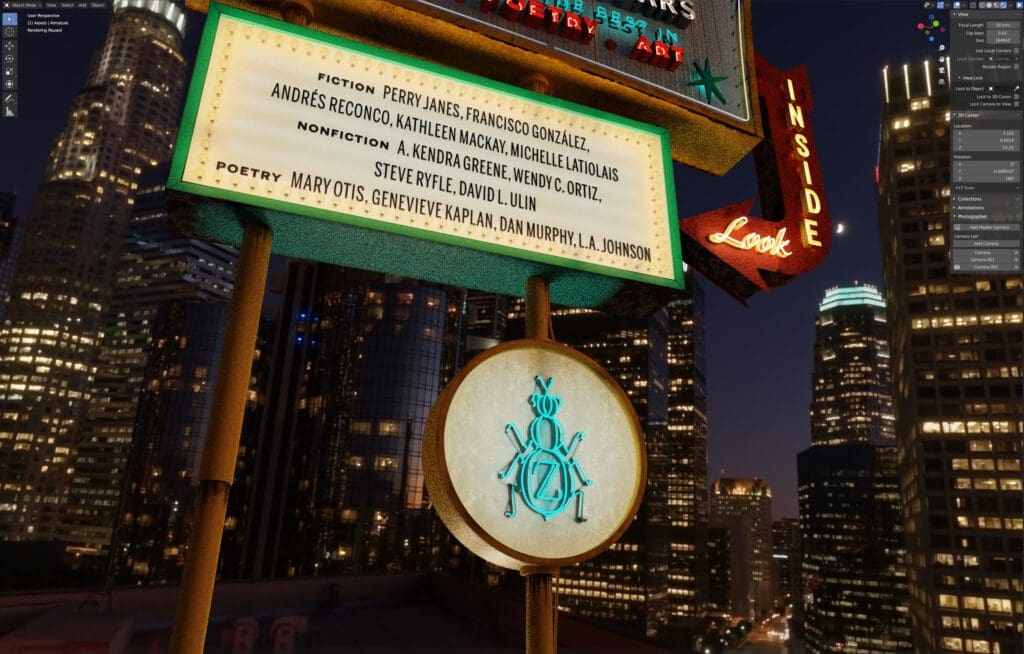
The last step was finishing up the backgrounds. 3D tools like Blender can utilize image-based lighting, which means that a spherical panoramic photograph compiled into an HDRI (high-dynamic range image) can provide all the light for a scene. This method mimics the way that light works in the real world, and makes it possible for computer-generated objects to appear very natural in any real-life context. I sourced light probe images that were shot in L.A. for the scene lighting, which I hope adds veracity to the sense of place.
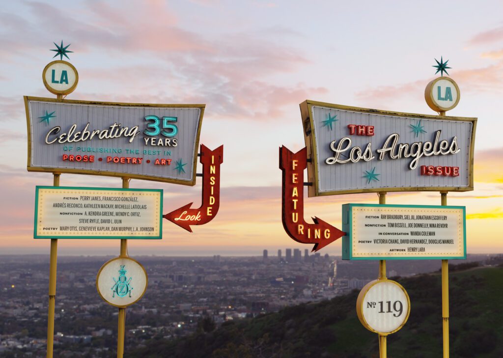
Some of my most salient memories of my time in Los Angeles are of the light. I moved to Oregon several years ago; the light here is so different. The way the sun filters through the atmosphere in Southern California is instantly recognizable to me. Delicious, rippling, cotton candy sunsets appeared so often that I took them for granted. Nowhere is the “golden hour” more golden. It is not an accident that the film industry grew up in Hollywood, where light is an abundant resource in such a variety of flavors. Even the way the sky glows warm at night—the awful beauty of the low-flying marine layer charged with the electricity of the sprawl below—I wanted to capture as much of that as I could in the cover art. There’s something to be said about the region’s relationship between the natural and the artificial, the exposed and the imposed. That ongoing dialogue makes L.A what it is.

