Dear Readers,
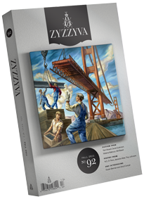
Welcome to the new ZYZZYVA. After 26 years we’ve given the journal a new look, even a new heft.
Over the past months we’ve worked on a redesign with Three Steps Ahead, the same California firm behind our new website. ZYZZYVA’s original print design, created with care by Thomas Ingalls & Associates in 1985, was elegant and restrained. We kept in mind the clarity and the spare beauty of their vision as we sought to add other elements speaking to the pleasures of print, to the craft of bookmaking, and to the stimulating quietude of reading. We considered paper weight and tone, typesetting and titles, mingled serifs with sans-serifs, discussed the old-fashioned whimsy of endpapers—always with a view toward presenting stories, poetry, and art in the best way possible.
Perhaps the most dramatic shift is in our cover design. This new presentation of cover art evokes how a work is thoughtfully displayed in a gallery or museum; the shadowing effect playfully reproduces the quality of a piece hanging on a wall. This nod to gallery exhibitions reflects our intent: to present the artwork we curate with the same attentiveness we bring to the literature we publish.
This issue features yet another vital development in our commitment to the visual arts: the journal’s first-ever full-color art spread. We are thrilled to inaugurate this new feature by showcasing stunning photographic portraits by Katy Grannan and striking paintings by Julio Cesar Morales.
Our primary focus is, as always, on publishing the highest quality art and literature; design is secondary, and must serve the content. But in this digitally driven age, it is incumbent on any publisher to consider all aspects of a print product, including the physicality of the object, and to answer fully a book reader’s implicit (sometimes explicit) query: why should I spend time with this journal?
Our implicit (now explicit) answer to you: because it offers a feast of contemporary poetry, prose and art. Because each issue seeks to be unexpected, fresh and affecting. Because your time is rewarded with our vigorous attention to every detail of the reading experience.
And not least of all: because this journal is also a beautiful object—one that, we hope, is pleasing to the eye, pleasing to the touch, and takes a place of pride and enjoyment in your home. We imagine ZYZZYVA on your coffee table, your bookshelf, your nightstand, there in a stack of other books by the bed or on the desk. And we hope that every time your gaze falls upon it you’re reminded anew of the sensory and cerebral pleasures of print.
L.

